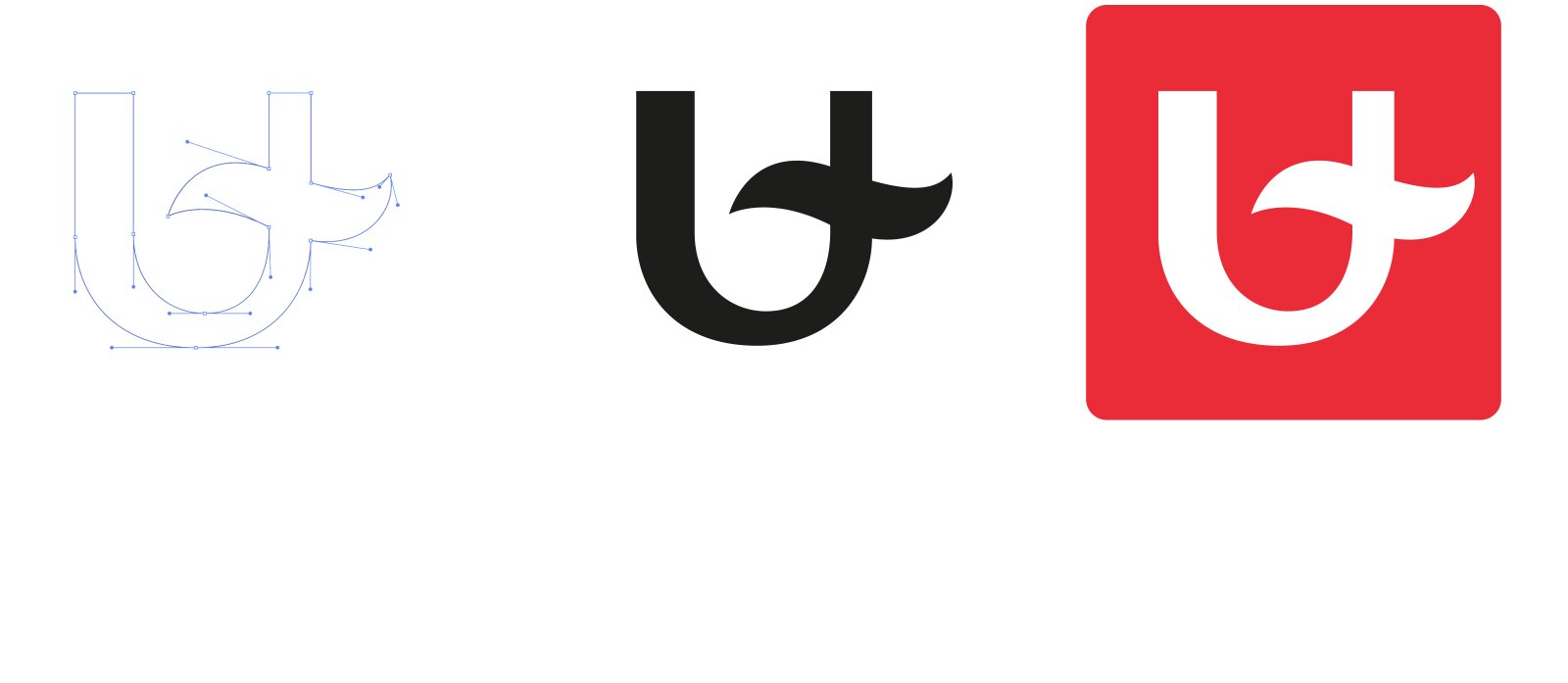
The basis of our
logo is the 'U' that we claim as a university. This 'U' is crossed by a wave
representing the Scheldt, as our university is located right in the heart of
Antwerp, the city on the river. The city is an endless source of challenges both
large and small, and the university senses these problems, studies them and
looks for solutions. We are a lab in the city.
The 'U' is in a
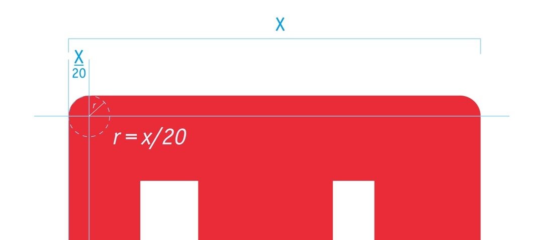
red square with rounded corners. The rounding is based on the width of the
square.
r = X/20 where r is the radius of the circle of curvature and X is the width of the logo.

